If you need the best magazine font for your next editorial design project, you can look through the list below. In this post, we’ve gathered everything related to editorial fonts and typefaces for magazines. From magazine cover fonts to magazine text fonts, and fonts for different industries, you can learn all about typography for editorial design.
When it comes to editorial design, choosing the best magazine fonts can be a challenge. They can make or break the interest of your readership. This post is here to help you out. Plus, if you’ve ever wondered what editorial font a magazine uses, we’ve included some of the most renowned magazine fonts out there.
Best Fonts for Magazine Design
If you’ve ever worked in editorial design, you have probably struggled with finding magazine typography that’s clear and portrays the right mood.
First and foremost, consider the brand personality of the magazine as a whole. Every font has a personality, and that’s a big part of brand design. Make sure that the font you choose resonates with what the brand and magazine stand for.
Communication is the purpose of typography. The right font will speak to your readership, so choose a font that will connect with them at an emotional level. Consider the context and how the font will function.
Make sure the first boxes you check off are readability and legibility. Try not to sacrifice functionality for the looks of the magazine. Every font has a purpose—it’s just a matter of finding the perfect one for the project.
Tips for Choosing Fonts for Magazine Design
There are many factors involved when it comes to choosing the right magazine typography. We’ve put together some tips to consider when you’re in the process of selecting fonts for magazines:
- Font style: consider the emotional attributes embedded in a font and how they relate to your readership. Consider the brand itself and how you’ll be using the font of choice.
- Font combinations: Find the perfect pairing of a serif font and a sans serif. This combo will create a nice texture on the page and hierarchy to set apart different sections of the magazine.
- Create contrast: Choose fonts that are different enough to create a strong contrast. This will help guide the reader through the magazine.
- Create emphasis: If you’re working on a big publication with main stories, choose different display fonts that go with the theme of the content. This will help set the story apart from the rest of the magazine.
- Legibility and readability: the top priority for body copy is that it’s read with clarity. Choose fonts that are easy and enjoyable to read. Try not to get too experimental with the arrangement when it comes to kerning and tracking.
- Test your design: It’s always good to test your font choices before using them. Use them on a fictional layout and print a spread to see how comfortably you can read the copy text. For instance, as a rule of thumb, the font size for an A5 magazine is between 9 and 11 points. This should be a good starting point.
Best Magazine Fonts for Sports Publications
Rockster Casual Sans (TTF, OTF)
The Thrasher magazine font is one of the most iconic in the world of skateboarding. Rockster is a great dupe for this magazine letter font—while it isn’t exactly the same, it evokes the same feeling. This casual sans serif has that handwritten and laid-back vibe.


Uniclo (OTF, TTF)
Sports magazines are all about being dynamic. Uniclo is a great font that just looks amazing in its italic form. This is one of the best fonts for magazine covers because the font is chunky and substantial. This is a great font if you are looking to create some impact on newsstands!


Forever Freedom (OTF, TTF)
Tall fonts have a way of looking super dynamic and fast, especially if they are in italics. This modern and striking magazine font is great for a magazine cover or to use as a headline in a story. It evokes speed and is sure to captivate your audience.


Maqin Larisa Display Font (TTF, OTF)
Designing an old-style sports magazine? Maqin Larisa is a display font that resembles baseball-style typefaces with its geometric shape. This magazine letter font is suitable as a magazine headline for a baseball-themed article.


Blackheat Display Font (OTF, TTF)
Energetic and strong, this font will make your sports magazine look like you mean serious business. This magazine letter font pack includes four styles and includes a version that is just the outline stroke. The fonts also include multilingual support so you’re ready to translate your content into different languages.


Best Editorial Fonts for Music Magazines
Signia Pro (OTF, TTF, EOT, SVG, TTF, WOFF)
The British NME magazine is no longer in print but has been around since the 50s—now it only exists online. The NME magazine font is a geometric sans serif, and Signia Pro is a great dupe for it, especially if you are looking for the best font for magazine articles. If you are looking for the best free font options, a really close alternative is Montserrat from Google Fonts.


Funkies (OTF, TTF)
If you are looking for retro music-themed fonts, Funkies evokes that 70s feeling. This magazine letter font is bright, and it’s really close to the Rolling Stone magazine logo. The font includes many stylistic alternates, so you can add swashes to any of the characters. If you’re looking for a free option for the Rolling Stone magazine font, check out Royal Acidbath.


SoundBlast (TTF)
If you’re looking for a multipurpose font, SoundBlast is an all caps brush font appropriate for magazine articles. The font has a single brush stroke style throughout all the characters. This display magazine letter font is also suitable for branding and poster design.


Grunge! (OTF, TTF, WOFF)
The metal and rock & roll music genres have a grungy and laid-back personality. Handwritten fonts best convey the unfinished and unpolished vibe that these music genres always stood for. Grunge! is suitable as a magazine cover font, and this magazine font style won’t let you go unnoticed.


Best Magazine Typography for Journalism Publications
Saint Capital Modern Serif Typeface (TTF)
This playful modern serif font is a great alternative to the New York magazine font. The characters have a classic line, with a twist of minimalist design. This elegant font is one of the best fonts for magazine design because it’s so versatile. If you’re looking for free fonts, a good alternative is DM Serif Text from Google Fonts.


Mondia (OTF)
If you’re looking to brand a journalism magazine, Mondia is an amazing choice. This contemporary font includes a high contrast between thick and thin strokes, so it lends a touch of style to its personality. This is the best font for magazines with lots of text content because it was designed to work both as display and body copy.


ELMODER Regular (OTF, TTF)
Here’s an iconic font suitable for branding a journalism magazine. This super contemporary magazine letter font evokes an elegant personality. While this isn’t your typical sans serif font, ELMODER possesses a seriousness that makes it suitable for a journalism magazine.


Pioggia (OTF, TTF)
If your journalism magazine has a younger target market, Pioggia is a modern and playful serif font. Lots of attention went into designing this font with beautiful details, so you can play with the alternate characters and explore the many options. This versatile typeface is one of the best fonts for magazine covers.


Best Magazine Fonts for Fashion/Celebrity Publications
Kenjo (WOFF)
Font magazines with a high contrast between thick and thin strokes evoke elegance and high fashion, and that’s exactly what Kenjo does. If you’re looking for Vogue magazine font styles, this font is a great option. It has Art Deco and Japanese influence, and it’s the best font for a magazine headline that’s stylish and elegant. If you’re looking for a free font that looks similar to the Vogue magazine font, Playfair from Google Fonts is a good option.


Brioche (TTF)
The Harper’s Bazaar magazine font is also similar to Vogue’s. This fashion magazine also uses a font that has high contrast between thick and thin strokes. Brioche is a classic modern serif with many alternates that make it look very stylish. Otama e.p. from Font Squirrel is the same Didone style font as the Bazaar magazine font.


Elegant Karin (TTF, OTF, WOFF)
If you’re looking to portray a stylish vintage flair, Elegant Karin is the best font for magazine headlines. This minimalist magazine font style includes beautiful ligatures and glyphs to choose from that can add a special touch to any magazine headline.


Gorgeous (TTF, OTF, WOFF)
Didone style fonts are super sophisticated, and so is Gorgeous. This magazine font is perfect for anything fashion-related. Use this font as a headline on a story, and you’ll see how it instantly makes the page stylish and elegant.


Best Editorial Fonts for Lifestyle Magazines
Giga Sans (OTF)
Giga Sans is a super-clean geometric magazine font. The best fonts for magazine headlines are strong and powerful. Giga Sans is one of those, you can mix and match the nine weights included in this pack. If you are looking for the Essence magazine font dupe, this is a great option.


Baille Simpson (TTF)
Looking for a specific typeface for a magazine article? Baille Simpson is a modern brush magazine font that’s versatile and chic. Use it for magazine articles or as a magazine cover font. Since this style is flexible, this magazine font can also be used on logos, books, and even packaging design.


Girly Moods Script (OTF)
If you want to add a feminine touch to your project, this handwritten script font is the one. The strokes on each character flow naturally, making it look very authentic and not computer-generated. While this is a great magazine font, it has many purposes and can be used on books, logos, and even branding.


Flow (OTF, WOFF)
Flow is one of the best fonts for magazine articles. This OpenType font comes in an SVG format that allows you to access all the different layers of the font. This oil-paint font is experimental and perfect if you want to highlight a specific article in your magazine design.


Magnetico (TTF)
Looking to emphasize certain parts of your magazine design? Magnetico is a modern font that can help you take your page layout to the next level. This italic sans serif has a very laid-back and relaxed personality that is key in a lifestyle magazine.


Best Magazine Typography for Film Publications
Fonseca (OTF)
Fonts inspired by the early 20th Century and Art Deco are synonymous with glamour and movies. Empire is a film magazine that uses a geometric font on its cover. Fonseca is a perfect dupe, mimicking that old-time elegance. This substitute Empire magazine font download includes eight weights with their respective italic versions.


Suburbia (OTF, TTF, WOFF)
This Saul Bass inspired magazine cutout font is made up of geometric shapes and has a casual appearance. Saul Bass was famous for his title sequences in movies, so this font is perfect for a magazine project. This is one of the best fonts for a magazine article because Saul Bass is so well known, so it would instantly communicate the film quality you’re trying to convey.


Norman (TTF, OTF)
Norman is a vintage font in a handwritten brush style. The characters look very inky and heavy, so it’s perfect if you’re looking to put the spotlight on a specific article in a magazine. Mix and match lowercase and uppercase characters and explore the glyphs and swashes to emphasize certain words.


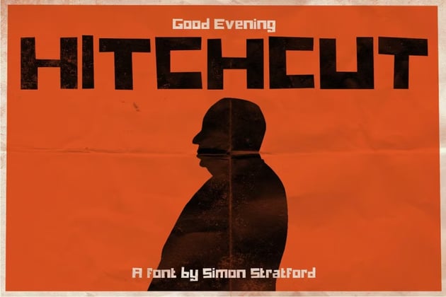
Hitchcut (OTF, TTF)
Any movie fanatic will understand why this font is perfect for a film magazine. Not only is it referencing one of the greats, the mastermind behind cinematic classics, but it has a personality and heaviness to it that demands attention. Create eye-catching cover lines, and your magazine will stand out on newsstands.

Carbon (OTF, TTF, EOT, TTF, WOFF, SVG)
Carbon is a super-clean font suitable for magazine covers and headlines. The sans serif has a modern take on Art Deco fonts, and the result is very futuristic. Movies are all about transporting us to another time, and this font can do exactly that in a magazine.


Best Body Magazine Text Fonts
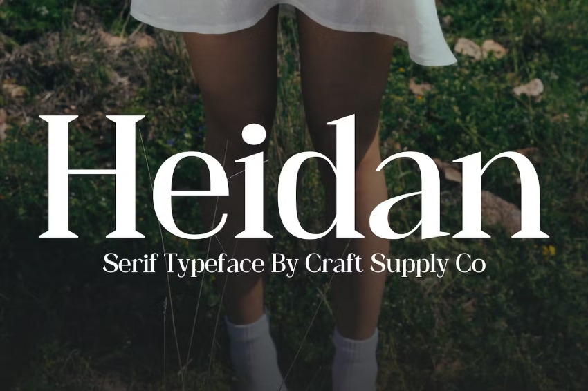
Heidan Wedge Serif Font (OTF, WOFF)
Heidan is an inspired font that offers clarity, legibility, and functionality, while also adding style and careful design to your text. This contemporary font works with different thicknesses, helping it to create a dynamic look and feel. Hands down, this serif is one of the best body text fonts for magazines.

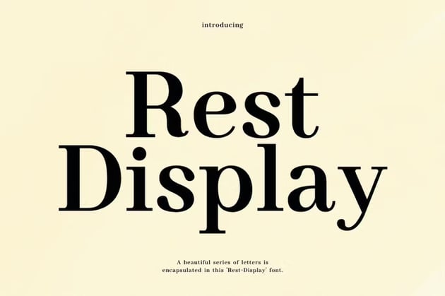
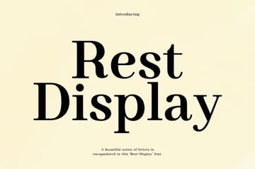
Rest-Display Modern Serif Font Typeface (OTF, TTF, WOFF)
A body of text font doesn’t need to be boring. Take Rest, a beautiful serif font that is definitely one of the best fonts for magazine body text. The font is practical, versatile, minimalist, and balanced. It’s my go-to serif font and works for large and smaller text.

Madelin Serif (TTF, OTF, WOFF)
Madelin is an adaptable serif font suitable for body copy. It comes in five weights, and the Regular version is highly legible at smaller point sizes. The heavier weights are perfect for magazine articles as headlines. The set is one of the best serif fonts for magazines, and it also comes with a web font kit if you want to take your project online.


With These Editorial Fonts, You’ll Be Ready for Your Next Project
This list features amazing resources for your next editorial design project. Choosing the best magazine fonts is not easy, but with the tips we provided on magazine typography, you’re set up for success. You learned what font magazines use, and we gave you options for magazine text fonts, magazine cover fonts, and lots of great assets from Envato Elements.
If you liked this font magazine article, you might like these other helpful tutorials below:


