Colour in film and TV, is a powerful storytelling tool. It can manipulate our emotions, direct our attention, or send us subtle messages that we may not even be consciously aware of. In this article we’ll take a look at the psychology of colour in Film, TV, and Video, and show you some great examples!
The Psychology of Colour in Film, TV, and Video
Colour Symbolism in Film: Some Colour Theory
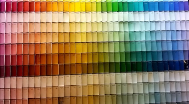

Don’t groan too much, we just need to cover a bit of basic theory because it helps us understand colour relationships and their emotional potential!
Hue, Saturation, Brightness
It’s useful to know what these things are when we’re talking about colour.
- Hue is the core colour, the position on the colour wheel if you like (we’ll come to colour wheels in a second). It’s independent of intensity or brightness.
- Saturation is how vivid the colour is, how intense. If you made the colour paler, you’d be reducing the saturation, if you made it more vibrant, you’d be increasing it.
- Brightness is how much light the colour reflects. Dark shades (think navy blue for example) have a low brightness, they absorb more light. Lighter shades (like yellow) have high brightness – they reflect more light.
Value, Chroma, Temperature
It’s not as integral, but it’s useful to know these terms too.
- Value is the colours lightness or darkness compared to others; in relation to each other.
- Chroma measures a colour’s distance from grey, so high chroma is close to the pure hue, and low chroma is closer to grey.
- Temperature means colours can be warm or cold, based on how we actually associate temperatures, so warm colours are reds, oranges, yellows (think fire, the sun, and so on) and cold colours are blues, greens, purples (snow, ice, water).
Colour Symbolism in Film: The Colour Wheel


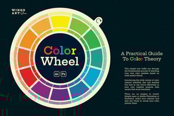
A colour wheel is a chart that shows you those colour relationships we mentioned, typically they’re sorted by primary, secondary, and tertiary colours and each has its own place on the wheel. How they’re placed helps us understand how they interact and complement (or contrast with) each other.
Primary Colours
These are red, yellow, and blue and they form the foundation of the colour wheel. These colours can’t be created by mixing other colours.
Secondary Colours
Mixing primary colours creates secondary colours. These are: orange (red+yellow), green (blue+yellow), and purple (red + blue).
Tertiary Colours
In a simple sense, combining a primary and secondary colour gives us a tertiary colour. Some theorists say tertiary colours are created by the mixing of secondary colours. It doesn’t matter too much for our purposes!
Colour Meaning in Film – What do the Colours Mean?
By looking at the colour wheel you can see easily which colours complement each other – these colours are usually sat directly opposite one another. You can also identify warm and cool colours. The relationships between colours and emotions are too vast to go into here, but there are some general associations that most people agree exist – here are some of the common ones.
Warm Colours

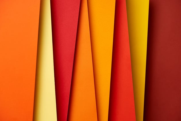

- Red: passion, love, anger, danger, excitement, and energy. Can be stimulating and attention-grabbing, but also aggressive and overwhelming in heavy doses.
- Orange: joy, creativity, enthusiasm, warmth, and optimism. Energetic and uplifting, but can also feel cheap or childish if used too much.
- Yellow: happiness, cheerfulness, hope, intellect, and mental clarity. Bright and optimistic, but can also come across as nervous or anxious in large amounts.
Cool Colours

- Blue: calmness, peace, security, trust, and loyalty. Can be relaxing and soothing, but also sad or depressing depending on the shade and context.
- Green: nature, growth, new beginnings, health, and balance. Calming and peaceful, but can feel stagnant or unimaginative in certain shades.
- Purple: luxury, mystery, wisdom, and spirituality. Can be elegant and sophisticated, but melancholic or intimidating depending on the hue.
Neutral Colours


- White: purity, innocence, cleanliness, simplicity, and faith. Can be calming and refreshing, but sterile or cold in some settings.
- Black: power, sophistication, elegance, evil, and death. Can be striking and dramatic, but also gloomy or oppressive if used too much.
- Gray: neutrality, balance, formality, and practicality. Can be calming and understated, but also boring or indecisive in some situations.
These are not exhaustive, there are many more, and of course exceptions to the rules, too. Colours can also mean different things to different cultures, which is something to be aware of when it comes to prospective audiences.
Colour Symbolism in Movies and TV: Examples
We’ve looked at colour and what it can do when it becomes a narrative tool, so now let’s take a look at some uses of colour symbolism in movies (and TV) with examples.
Colour Psychology in Film: The Matrix (1999)
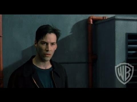
The pervasive green tint of the Matrix signifies the artificiality of the virtual world, contrasting with the warm, natural tones of the real world, highlighting the film’s central theme of illusion vs. reality. It helps us think of the world of the matrix as ‘sick,’ the kind of green we associate with nausea.
Colour Psychology in Film: Sin City (2005)
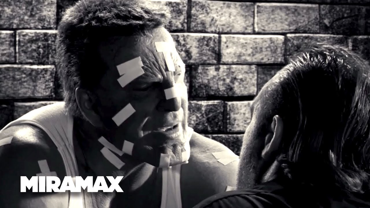
Sin City’s colouring (or lack of!) was widely hyped. The stark black and white background, accentuated with bursts of vibrant red and yellow, creates a hyper-stylised world of violence and passion, reflecting the film’s graphic novel roots. It’s also a nod to film noir style, which tended to have themes of pessimism and menace throughout.
Colour Psychology in Film: The Grand Budapest Hotel (2014)

Wes Anderson’s pastel palette is well-known, and quite often a source of inspiration itself. It evokes a sense of whimsical nostalgia, which helps emphasise the film’s eccentric characters. Exaggerated colour schemes help Anderson to push elements of the plot without this becoming jarring or outlandish.
Colour Psychology in Film: Schindler’s List (1993)
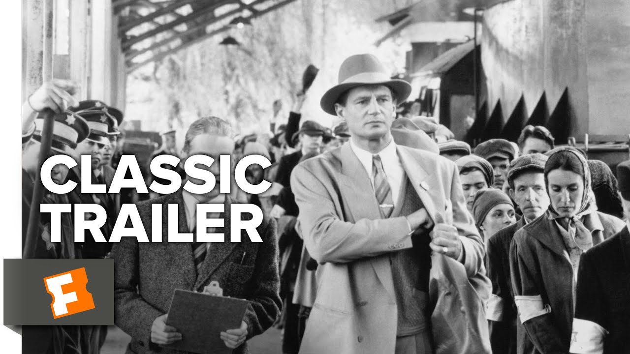
Schindler’s List is one of the most talked about films when it comes to colour psychology. The film’s almost entirely black and white palette emphasises the starkness and horror of the Holocaust, with the occasional splash of colour. A little girl in a red coat is one of these few instances, as Schindler spots her during the liquidation of the Krakow ghetto. Later, her coat (red again, against black and white) is seen again, this time on a cart of dead bodies, emphasising the brutality of the Nazis and that every single victim of the Holocaust is as ‘innocent’ and individual as this child.
Red is used in The Shining to similar effect, to foreshadow violence, danger, and Jack Torrance’s descent into madness.
Mad Men (2007-2015)

Mad Men uses colour to great effect in just about everything, from sets, to costumes, and even props. Check out TIME’s article on the use of colour in Mad Men.
Stranger Things (2016-present)
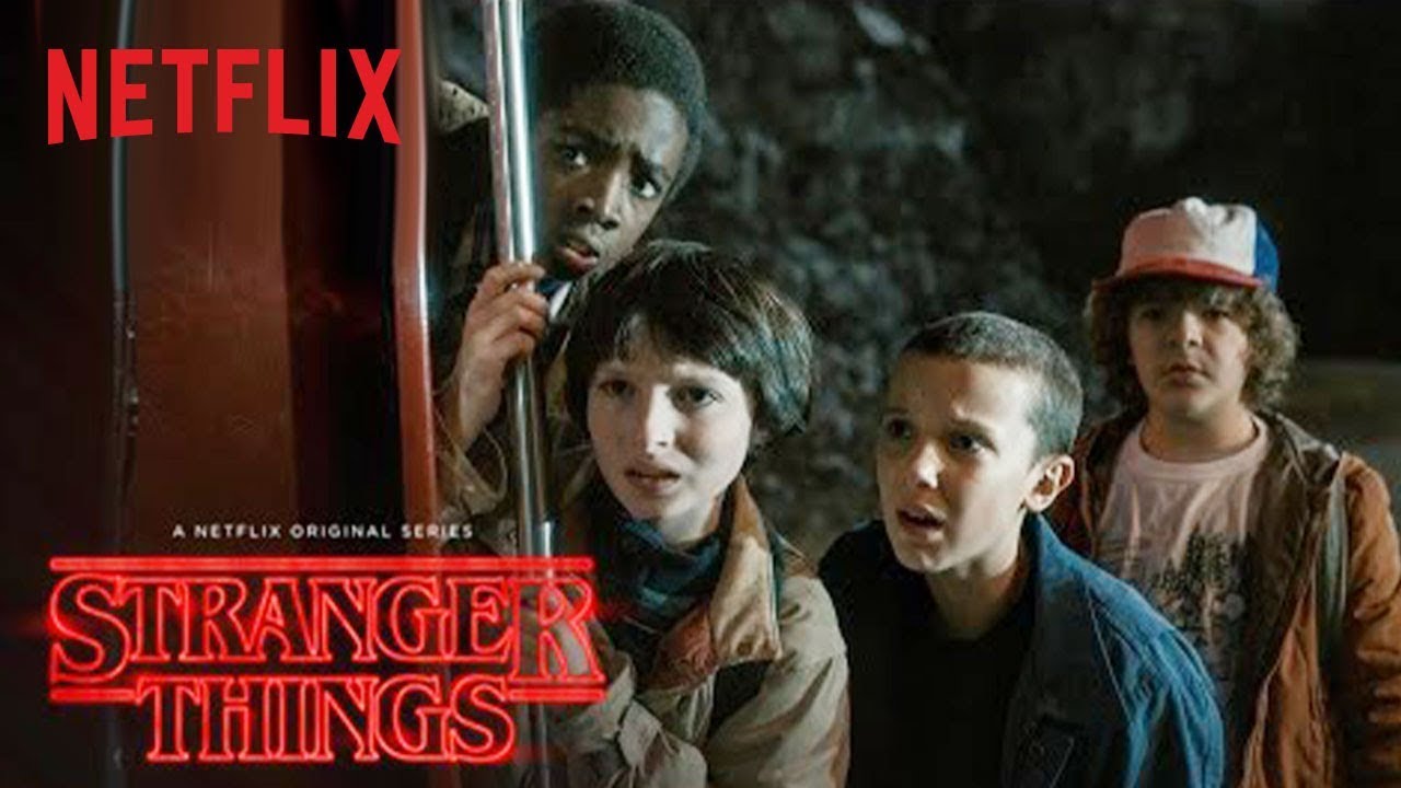
The warm, nostalgic hues of the 1980s contrast with the eerie, otherworldly blue-green tones of the Upside Down, creating a distinct visual language for the show’s mix of childhood adventure and sci-fi horror.
The Handmaid’s Tale (2017-present)
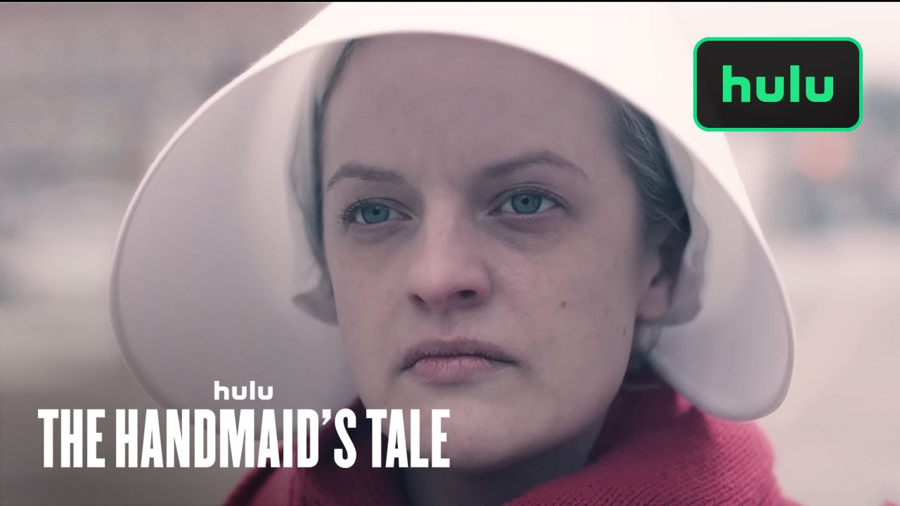
The Handmaid’s Tale has, in my humble opinion, some of the most effective use of colour in recent shows. Drawing faithfully from Atwood’s book on which the show is based, the visuals of the oppressive red of the handmaids’ outfits represent the subjugation of women in the dystopian Gilead (and also their supposed promiscuity and sexuality from before Gilead), often contrasting beautifully against backgrounds like stark white snow, which can give us the feeling of purity and innocence – another reason that the Commanders’ daughters wear white. Every character’s clothes ooze with colour psychology to the point where even just visually seeing one one screen is enough to understand their role in the show.
How to Use Colours in Filmmaking
If you want to try using the principles of colour psychology in your own filming work then here’s a practical guide on how you might integrate it into your creative process.
1. Understand Your Narrative
What emotions do you want to evoke? What themes are prevalent in your story? Think about the personalities of your characters and how colour can be used to reflect their journey or development.
2. Explore Colour Schemes
Experiment with different colour schemes to find the one that best suits your narrative. Think about complementary colours for harmony, contrasting colours for tension, or monochromatic palettes for a specific mood. The choice of colours should fit well with the tone and atmosphere that you’re going for.
3. Research Colour Associations
Get to know the traditional associations of colours and their psychological impact, and also learn about the cultural and contextual variations in colour meanings. This is really important because you may do the exact opposite of what you intended! There’s also a lot of nuance in the usage of certain colours. For example red might mean danger, but it can also represent love and passion.


4. Pay Attention to Set Design and Wardrobe
Colour isn’t just about grading, you should consider the colours of your sets, costumes, and props, too. These can contribute to the overall impact of your work so make sure that (if you’re in a team) the production designer and costume person are on the same page about any intentional uses of colour.
5. Test and Refine
You would refine your script or edit your footage more than once, so be open to testing and adjusting your colour choices. You could try test screenings or share visual samples with a group to get feedback and then if some of your decisions aren’t landing like you thought they would, there’s time to adjust before a wider release.
6. Keep up with Trends
Keeping up with current trends of colours in filmmaking can be useful. It doesn’t mean you have to follow them, but at least if you know what’s en vogue you can potentially get a fresh perspective or at least know what’s hitting with contemporary audiences at the time. Never chase a trend for the sake of it though.
7. Learn from the Pros
Watching and learning from the works of great film-makers and visual storytellers is a great way to understand how to use colour effectively. You may even decide that you hate a particular style – Wes Anderson’s colour choices, as an example, can be very hit and miss with people.
Conclusion: Colour Meaning in Films
A lot of thought goes into the use of colour in movies and TV, whether that’s the overall look of the piece, the costumes worn by characters, or the props decorating the sets. They’re a powerful storytelling device that can influence your emotions and overall understanding of the story being told. Masters of colour, like Spielberg or Anderson, are known for their clever use of colour, whether that’s an in-your-face pastel palette favoured by the latter, or more subtle punches like Spielberg’s ‘girl in the red coat’ as we saw from Schindler’s List.
Colour palettes can evolve and shift too, either throughout a film, or more gradually through a TV series, so next time you watch your favourite movie or show, look out for all the nuance you can find in the colours used, and if you’re a filmmaker, try to bring colour phycology into your own work by giving our tips a try.
If you love all things Film, TV, and video, then you’ll love Envato Elements, where you can access thousands of great resources for one monthly subscription, and use as many as you like!


Every month you’ll find some free files to choose from, too.
More Film, TV, and Colour Theory Tutorials and Articles
About This Page
This page was written by Marie Gardiner. Marie is a writer, author, and photographer. It was edited by Gonzalo Angulo. Gonzalo is an editor, writer and illustrator.


