
Ancient Rome and the Middle Ages
Before the invention of what we now know as italics and way before the invention of the printing press, Roman cursives were used in Ancient Rome.
For formal writing, most people used square capitals; these are the ones we see engraved on monuments. But Old Roman Cursive was the everyday form of communication for quick and informal writing. Schoolchildren also used this cursive to learn the Latin Alphabet. This type of script font uses many ligatures and is hard to recognize. Early Old Roman Cursive started as upright and evolved to a more slanted and narrower form over time, which was mainly due to writing efficiency—it was quick and informal. Around the 4th century, Old Roman Cursive was banned from public use and was only allowed to be used in legal documents. Nevertheless, its slanted style makes it a very early precursor of italics.

Old Roman Cursive developed into New Roman Cursive and was used between the 3rd and 10th centuries, this time by the general public. These letters eventually evolved into different regional scripts. New Roman Cursive also influenced the development of the uncial script, used before the 5th century, which resembles what we know as capital letters.

The uncial script eventually developed into Carolingian minuscule, which was the most commonly used type of alphabet in Christian texts. And from there, Carolingian minuscule developed into Gothic Blackletter.
Later in the 14th century, Italian humanists discovered manuscripts written with Carolingian minuscule and adopted the exact forms, assuming they had found manuscripts written in classical handwriting styles. This was a new style of letters flowing into one another through diagonal connections due to fast writing, creating rhythm between the words. The blackletter style already used these connections but wasn’t as legible as this new Carolingian minuscule. These scripts would later come to influence the development of italics.

Chancery Cursive
We can’t talk about italic fonts without touching on the cursive style of handwriting. There are two styles of chancery hand, English and Cursive, but for this article, we’ll talk about the latter. Cursive chancery hand was developed in the Vatican, and this is the true precursor of italic text. Niccolo Niccoli introduced a chancery hand in the 1420s, and the handwriting was based on the humanist minuscule (which was based on the Carolingian minuscule).

For chancery cursive, the pen was held at a 45-degree angle, allowing for faster writing while at the same time producing beautiful-looking text. Ludovico Vicentino degli Arrighi was a scribe in the Roman Catholic Church who wrote the first recorded writing manual. The chancery cursive handwriting used in this book was the direct model for Aldus Manutius to develop the italic style in his printing house in Venice.

The Introduction of the Printing Press
For italics to truly take hold, however, one more technical invention was needed: the printing press. Invented in Germany by Johannes Gutenberg in around 1440, the printing press changed the production of books forever. Before this, books were replicated by hand and reserved for the elite. The invention of the printing press allowed people to mass-produce books quickly and inexpensively by printing whole pages.


Movable type was invented by Bi-sheng around 1040, but Gutenberg, a goldsmith, was able to create durable movable type. This system allowed for faster typesetting and printing with metal pieces that would last. However, because this movable type was based on blackletter calligraphy, the amount of text that could fit on a single page was limited. Therefore, when creating longer books, it took more time to set up each page.
By the end of the 15th century, Nicolas Jenson created the first Roman typeface based on blackletter and Italian humanist calligraphy. This was the first time a letterform was designed on typographic principles. This invention helped save space and improve book printing.


Origin of Italics
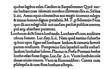
In the late 15th century, Aldus Manutius, who had studied Latin and Greek, was interested in compiling some of the Greek works and publishing them at a price. Manutius established a printing house in Venice and started reproducing manuscripts. He worked with multiple typographers and published many of their works.


Over time, many of these Greek and Latin publications were successful, but Manutius’s bigger breakthrough came when he introduced a smaller book format that fit in pockets at an affordable price. The size of this new format was called Aldines, and with it came the first use of italics.
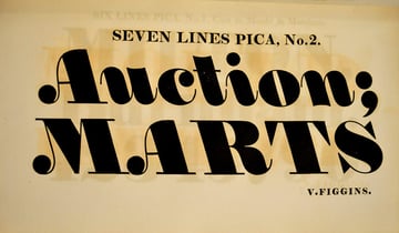
Manutius, along with Francesco Griffo, created the first italic because the slanted letters allowed more text to fit on a single page. So italics were first invented to save space, although now we use them to emphasize specific information.
Using italics rather than Roman type allowed pages to fit more characters on a single line at a point size that could still be legible. And with it also came ligatures based on real handwriting, saving even more space. Because Manutius was based in Venice, his printing style came to be known as “italic”, based on the Latin word “italicus” meaning “Italian”.
The French Italics
By the beginning of the 16th century, typeface production shifted to France. French designers took inspiration from the Italian fonts and even took elements from Aldus Manutius’s designs.
Claude Garamond, inspired by the Italian italics, developed his early designs with minor changes. By the mid-16th century, Garamond’s work became popular, and he started to stray from the Italian italic blueprint and develop his own style. He also found inspiration from Ludovico Vicentino degli Arrighi and the cursive chancery hand.
Robert Granjon, a publisher and punchcutter, started out producing Roman typefaces and eventually italics. Granjon also knew Christoph Plantin in Antwerp, allowing him to work in Paris and Antwerp. Plantin commissioned Granjon to design a special kind of script-cursive. The italic didn’t exactly follow the typical italics of the time, but many designers still consider it to be the French equivalent of the Italian italic.


The Evolution of Italics
By the 1820s, italics started to change dramatically. Italics had their origin in cursive handwriting, but this key component had completely disappeared by the 19th century. Italics became more mechanical, e.g. taking a Roman font and simply slanting it. No one knows the reason for this development, but once sans serif fonts were created, the slant effect was also applied to these. Eventually, the slope was applied in the opposite direction for advertising purposes.
.jpg)
Due to the Industrial Age and the booming economy, more type foundries were created. Type specimens during this time included a myriad of type options to use with lithography. Many of these font options also included some type of oblique version. After a while, the use of serifs and italics began to decline, and most people preferred to use advertising-style fonts.


By the 1920s, typeface designer Eric Gill came up with a sans serif font that had a humanistic touch, Gill Sans. This was the first sans serif of its kind, and the structure of some of the letters was completely rethought when used as italics to convey a more calligraphic feel.


Since then, we’ve seen all kinds of styles when it comes to italics. Univers by Adrian Frutiger is a sans serif font with a more systematic construction, shying away from the traditional calligraphic feel. In the present, italic fonts are no longer used to save space; instead, we have entered a more experimental era. We’ll look at some of the italics usage next.


Anatomy of Italics
Italics were first inspired by cursive writing, and later they were used for efficiency and to save printing costs. Over time, that has changed, and now italics have no rules. Italics have evolved to acquire different shapes, so let’s take a look at some of those.
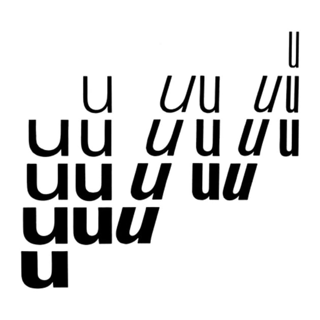
Serif Italics vs. Sans Serif Italics vs. Obliques
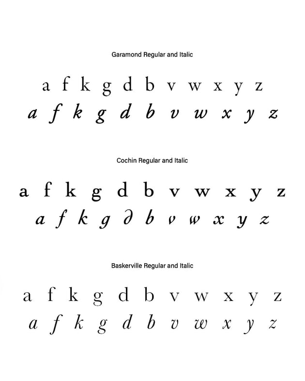
Serif italics are the italicized version of Roman letterforms when influenced by cursive handwriting. A few letterforms may change because of that: the letter a converts into a single-story a, and the letter f extends below the baseline.
Sans serif italics are rare, but they do exist. These are sans-serif fonts that are influenced by handwriting. This is true for humanist sans serif fonts like Gill Sans and FF Meta.
Oblique fonts are only used by sans serifs. Not all sans serif fonts are oblique, but all obliques are sans serifs. Oblique fonts are characterized by maintaining the same glyphs or letterforms but being slightly slanted to either the left or the right. In many cases, these fonts maintain the same curves and proportions.


Right- and Left-Leaning Italics
Traditional italics were designed as right-leaning because of the influence cursive handwriting had on them. Left-leaning italics came into the picture when more emphasis was needed. In cartography, left-leaning italics were used to indicate the names of rivers. Later, during the Industrial Revolution, left-leaning italics were used to create emphasis.


Constructing Italics
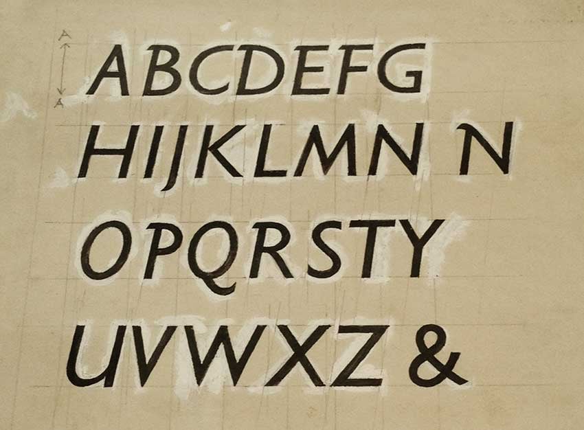
Since italics were first inspired by cursive handwriting, their construction has always depended on the writing instrument being used. Roman fonts started off with flat brushes, and even when letters were chiseled or letterpressed, the DNA could still be traced back to a specific brush.
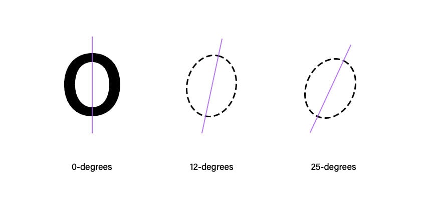
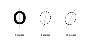
There are certain characteristics we can achieve when writing by hand. Any type of writing or font has a certain rhythm, in and out strokes, and a degree of slant. Roman fonts are constructed on a 0-degree y-axis. For an italic font, the ideal degree is about 12 degrees and a maximum of 25 degrees. The higher the degree, the wider the font looks.

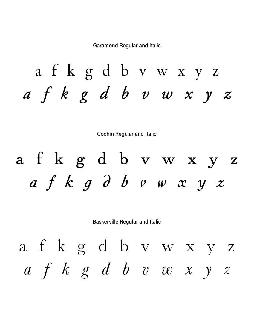
Many fonts designed as Roman with their respective italics are designed more traditionally. That’s to say that certain Roman characteristics are lost to adjust to a more cursive style. For instance, the Roman a and g change to match the anatomy of, say, d and b. The f has an additional tail when turned into an italic. The top angular stroke on the letter k has a loop or the top has a ball terminal. Swashes replace the serifs on the letters v, w, x, and y.

When to Use Italics
Italic fonts were first used to typeset whole books—this characteristic allowed designers to save space and make books affordable even though italics aren’t exactly legible. Many designers will now ask to use italics sparingly—that’s because as a rule of thumb, Roman typefaces are easier to read. But we’ve seen plenty of different and creative ways to use italics.
Keep in mind there are specific ways proofreaders and editors will use italics based on specific style manuals and guides. There are wrong uses of italics if they’re completely illegible, unless the point of a design piece is experimentation. Let’s take a look at some ways to incorporate them into a text:
- Emphasis: Italics are used to highlight important ideas or words. They can also be used for pull quotes. For this to work, it has to be used sparingly—too much emphasis means that nothing really stands out.
- Titles: Italicize the names of long publications (books, newspapers, magazines), movies, shows, and paintings. For shorter forms like poems or articles, however, you generally use quotation marks, not italics.
- New terms and foreign words: Italics can also be used for introducing new terms and foreign words. When a foreign word has become so familiar that it has its own dictionary definition in your language, however, there’s no need to italicize it.
- Prefaces: Italics can be used in prefaces, to distinguish quotations within paragraphs of text and comments.
- Scientific terms: We use italics for some scientific terms, like the Latin names of animal or plant species.
- Transportation: It’s customary to put the names of large vehicles like ships or spaceships in italics, although we don’t use italics for smaller vehicles like cars.
- Thoughts: In fiction, italics are often used to convey a character’s inner monologue.
- Design elements: A serif italic font and some true italic sans serifs can be used as design elements. These can be used when we want to convey a classic, feminine, or romantic look.
- Symbolism: A sans serif oblique font can be used to convey a sense of speed and adventure.
Conclusion
Italic fonts have had a comeback in the last few years, mainly being used as display fonts. We often see them on books or indexes, sometimes sprinkled here and there to emphasize text, but we often forget the long line they’ve had to go through to become what they are today.
In this article, we looked at a comprehensive history of italics, all the way from Ancient Rome and the Middle Ages through to the present day. We saw their evolution, inspiration, and influence. Italics had their decline, like many other design styles. And while italic type started as a way to mimic handwriting, and later on to save space, it still played an important part in educating large parts of Europe.
I hope that it’s now clear how and when you should use italics, and I hope you also picked up a few pointers on how you can design your own italic font.
If you liked this article, you might like:


